Identity checks, duplicate requests, and friendly empty screens
Three improvements around our online policy cancellation: every attempt now starts with a real identity check through MyID, the page no longer asks for card details when a request already exists, and "nothing here yet" screens finally help instead of confusing.
Online policy cancellation moves real money to a real card — so the flow has to be paranoid in the right places and gentle everywhere else. After the main feature shipped, I worked on three things that don't show up in a feature list but decide how the whole thing feels: proving who you are, not wasting your time, and never leaving you staring at a blank table.
Proving it's really you — every single time
Before anyone can cancel a policy, they now pass MyID — Uzbekistan's national identity verification, where you confirm with your face through the official app. I made this step one of the wizard, mandatory for every cancellation attempt, not a one-time checkbox: when money is about to leave an insurance company toward a card, "probably the owner" isn't good enough.
The part I'm happy about is how it's built. Our login window already had a working MyID verification flow — so instead of building a second, slightly different one for the wizard, I reused the exact same mechanism. The user sees one familiar experience everywhere, and the team maintains one piece of code instead of two.
Not asking for your card when there's no point
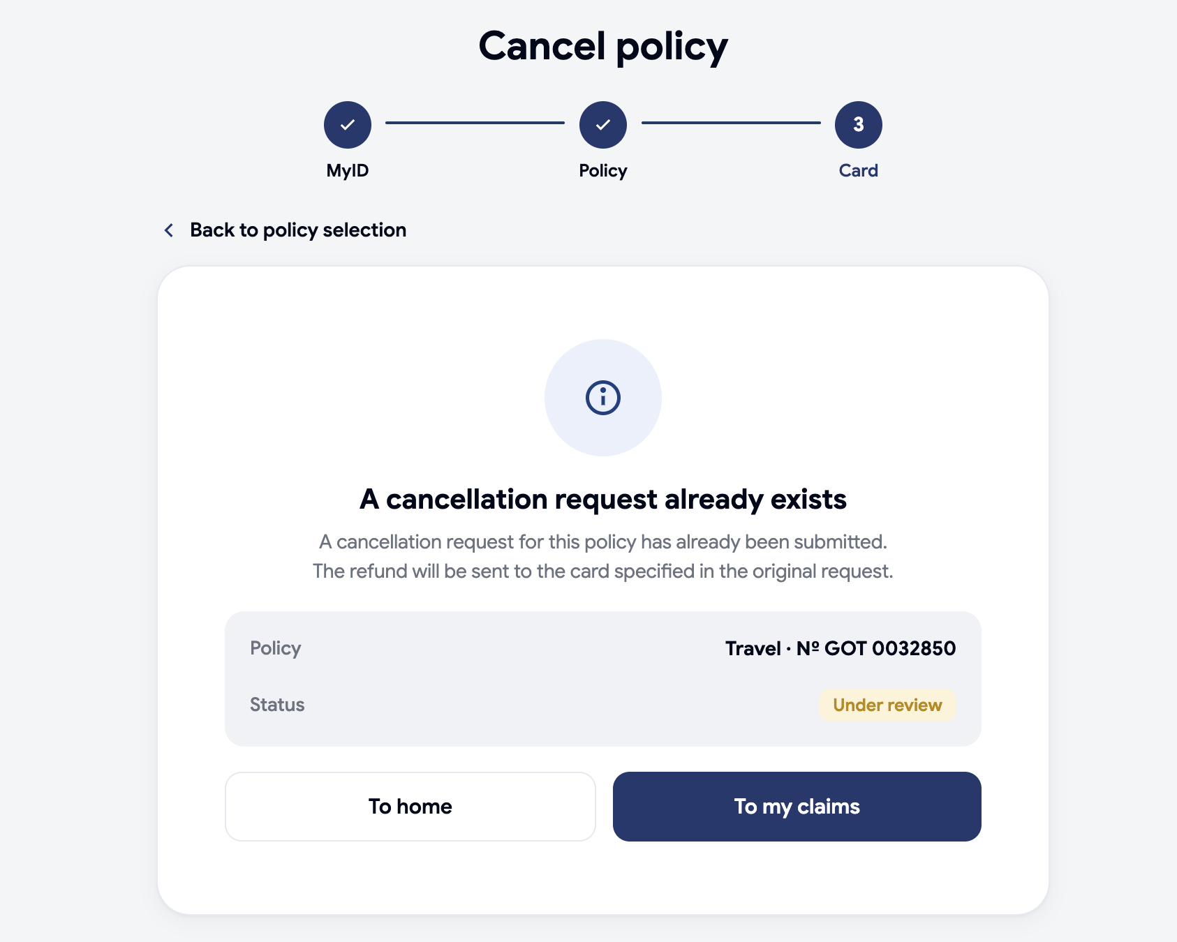
There was an unpleasant moment in the flow: if a cancellation request for your policy already existed, the page would still show the card-details form for a couple of seconds — and only then discover the duplicate and switch screens. You could literally start typing your card number into a form that was about to vanish.
Now the wizard checks first, asks second. Right after you pick a policy, a short "checking your policy…" moment quietly asks the system whether a request already exists. If it does, you go straight to a calm card showing that request and its current status — no form, no flash, no wasted typing. The refund calculation still runs in the background at the same time, so the extra safety costs almost no waiting.
When there's nothing to show, show something helpful
Empty screens are where products quietly feel broken. Ours used to show a bare empty table — technically correct, humanly useless. I redesigned both:
- "My requests" with no requests now explains what will appear here once you submit a claim or a cancellation — so a new user knows the page works and what it's for.
- "My policies" with no policies goes further: a friendly note that you don't have any policies yet, and a "Buy a policy" button leading straight to the catalog. A dead end became the start of the customer's journey.
Both states are translated into Uzbek, Russian, and English, and built from the same visual pieces as the rest of the cabinet, so they look native, not bolted on.
Why these small things matter
None of these three is a "feature" you'd put on a slide. But together they are the difference between a flow people trust with their money and one they abandon halfway. The identity check protects the refund, the early duplicate check respects the user's time, and the empty states turn silence into guidance.