Three days of making an insurance cabinet tell the truth
A three-day sprint on the gross.uz personal cabinet: switching it to a single trustworthy data source, finding policies users didn't know they had, and polishing the interface until it feels like an app instead of a website.
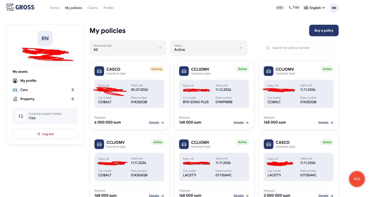
An insurance cabinet has one job: show a person their real policies, correctly. Over three days I found out ours was quietly failing at that in several ways - and fixed each one, across both the frontend and the backend.
Kicking out the fake data
The cabinet was mixing two sources of policies: our own web-app sales database and the national insurance registry. Digging into the data, I proved the local source was unreliable - test purchases, stale statuses, policies marked "active" that the registry had long cancelled. I cross-checked 40 real policies one by one against the registry to be sure.
So I removed the local source completely. Now the cabinet shows only what the official registry confirms - every status, every amount is the real one. I also fixed a subtle but serious bug: after logging out and back in as a different person, the cabinet could briefly show the previous user's policies from cache. Now the cache is wiped on every logout and login.
Finding policies people didn't know they had
The registry looks up a person's contracts by their personal ID number (PINFL). The problem: older policies were registered by passport number only, before the person's ID was linked - so they were invisible in the cabinet.
I reworked the backend to identify the user in two ways at once - by ID number and by passport plus birth date - then merge the results and remove duplicates. The payoff was immediate: one of our test users, who always saw an empty cabinet, suddenly got his real accident-insurance policy back. Another gained three policies nobody knew were his.
The fun part: the registry's documentation didn't say what field names it expected. I discovered them by reading the API's own validation errors - letting the server tell me its rules one message at a time.
Making it feel like an app
The cabinet also got structural work:
- A fixed profile sidebar on every cabinet page, not just two of them.
- Instant page loads - policies are pre-fetched when the cabinet opens, so the "My policies" page appears with no loading screen. A preloader only shows on a cold reload.
- A smooth fade when moving between pages - and while adding it, I found and fixed a nasty bug where fast navigation could leave the page permanently blank.
Dozens of small things users actually notice
Real quality lives in details, so the sprint also included: a status filter that shows active policies first, with expiring-soon ones on top; redesigned policy cards for cars and travel (policy number and end date lead, noise like VIN and series removed); travel cards ready to show the destination country and trip purpose the moment the registry starts sending them; fixed floating buttons that were half-hidden on iPhones; aligned form fields that broke in Uzbek and English; and cleaned-up translations in all three languages.