Never typing your passport number twice
Buying a policy online meant typing out your documents, then your spouse's, then every driver's — on a phone, with the papers in another room. Most of that information was already in the customer's account, so I taught the forms to offer it.
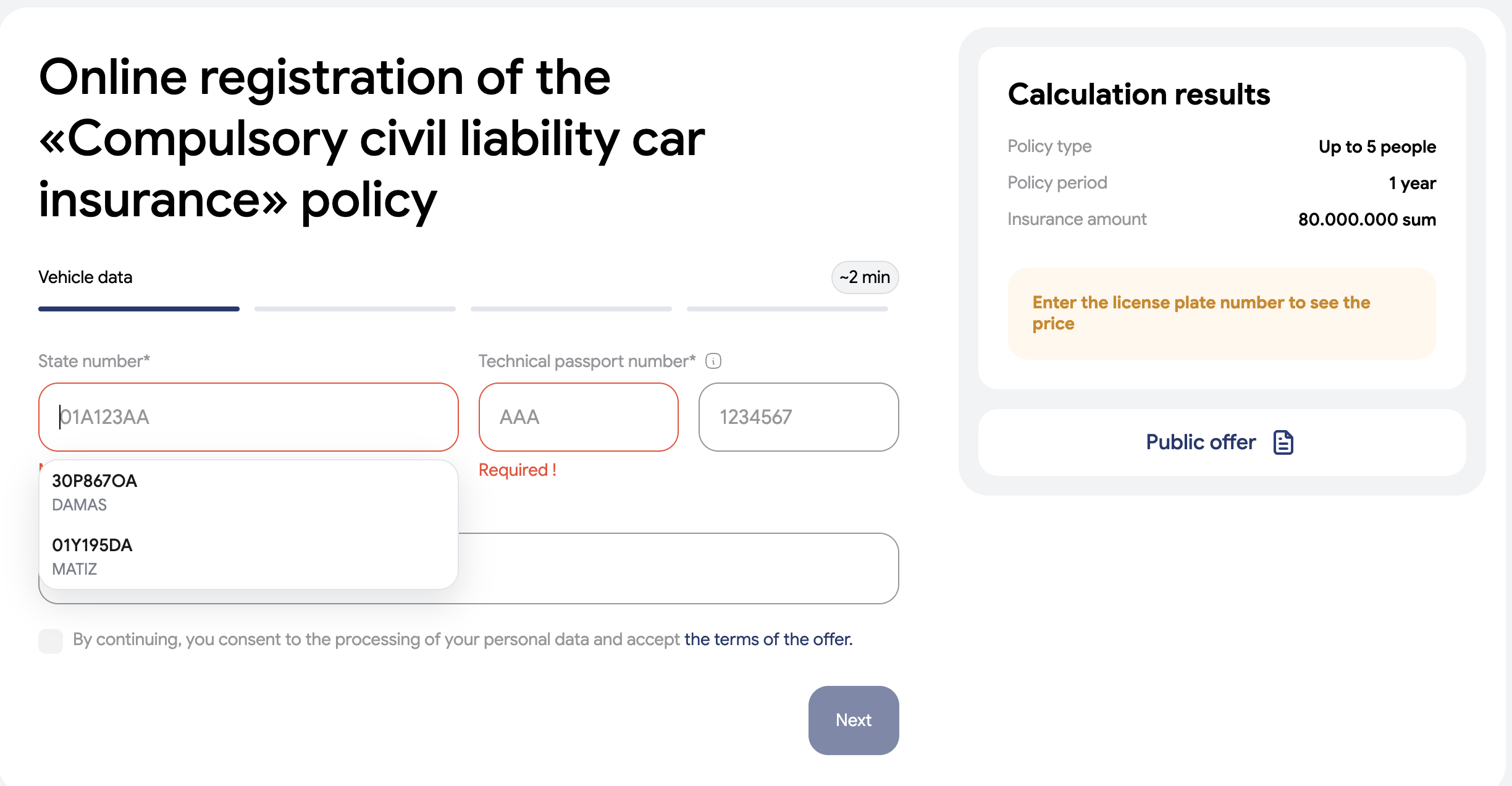
Buying insurance online means typing documents. Passport series and number, date of birth, national ID, the plate on the car, the figures off the vehicle registration — and then all of it again for your spouse, and once more for every driver you want covered.
Almost all of that was already in our system. The customer had entered it before, or we had checked it against the state registry. The calculators simply had no idea it existed.
Documents in a drawer
The calculators were built before the personal account existed, and each one was written as if every visitor were a stranger walking in off the street.
That produced some genuinely miserable moments:
- A motor policy with four drivers is around forty fields of document numbers, typed on a phone.
- The documents are rarely to hand, so the form gets abandoned halfway and started again later.
- The same customer had already typed the same details for last year's policy.
We were asking people to prove, from memory, things we already knew about them.
One tap instead of forty fields
Now, tapping a passport field drops a short list under it: the people saved in your account — you, your spouse, your children. Pick one and the whole group fills at once — series, number, date of birth, national ID.
The same works for cars, offered by their plate and labelled with make and year, and for property, offered by address and labelled with its size. It runs in nine different calculators — motor liability, casco, travel, health, passenger, property, gas cylinder, licence plate and document cover — all of them originally built separately.
The details that decide whether people trust it
A suggestion that is wrong even occasionally is worse than none at all, so most of the work went into when not to offer something:
- Only people who fit. A form asking for a child's details offers only the children; an adult form offers only adults. Suggesting a six-year-old where an adult is required destroys confidence in the whole feature.
- Each person once. On a multi-driver policy, anyone already chosen disappears from the remaining slots. People are matched by national ID or passport pair, ignoring spacing and capitals, so the same person saved twice still counts as one.
- Verified data only. Passport details are offered only from profiles confirmed through the national digital ID — never from something typed in and never checked.
- Staying out of the way. The list hides itself whenever the phone's own dropdown is open, so our suggestions never cover the picker the customer is actually using.
Why I'm proud of it
It's one shared piece of code, reused across nine forms written by different people at different times, and not one of those forms had to be rebuilt to accept it. It shipped behind a switch so it could be turned off instantly if it misbehaved.
The part I like most is that it compounds. When we later started verifying a car owner's passport against the state registry, that newly verified detail immediately became a suggestion too. Every fact the account learns makes the next purchase shorter — which is a much better trade than asking the customer to type it again.